From blocker to customer-adoption enabler in large-fleet operations.
I led discovery and design strategy for Live View end-to-end — running the customer interviews, cross-functional workshops, and the 795-user analytics study that reframed the problem from "build a better map" to communication-first monitoring. I owned the design direction and the core decisions, directing a UI designer on execution. The customizable grid — letting truck, trailer, and mixed fleets each surface the data they actually need — was my concept and my call, and it became the decision the whole solution turned on.
Company
ZF SCALAR
Date
January, 2025
Duration
10 months
Stage
Development Phase 2
Role
Lead Product Designer
Team
1 Lead, 3 Product Designers, PM, PO, SA, UI Designer

SCALAR Live-view with customizable widgets and customizable grid.
Company context
SCALAR is an enterprise fleet-management platform. The company's primary goal is to migrate customers off a costly legacy platform that's scheduled to be retired — a move that will save significantly on maintenance.
The challenge
The legacy system is powerful and mature, and rebuilding its full depth of features within the migration timeline is far from guaranteed. Every screen we migrate has to earn that switch — which is exactly what made Live View, the screen dispatchers use most, so critical.
From problem to impact
The problem
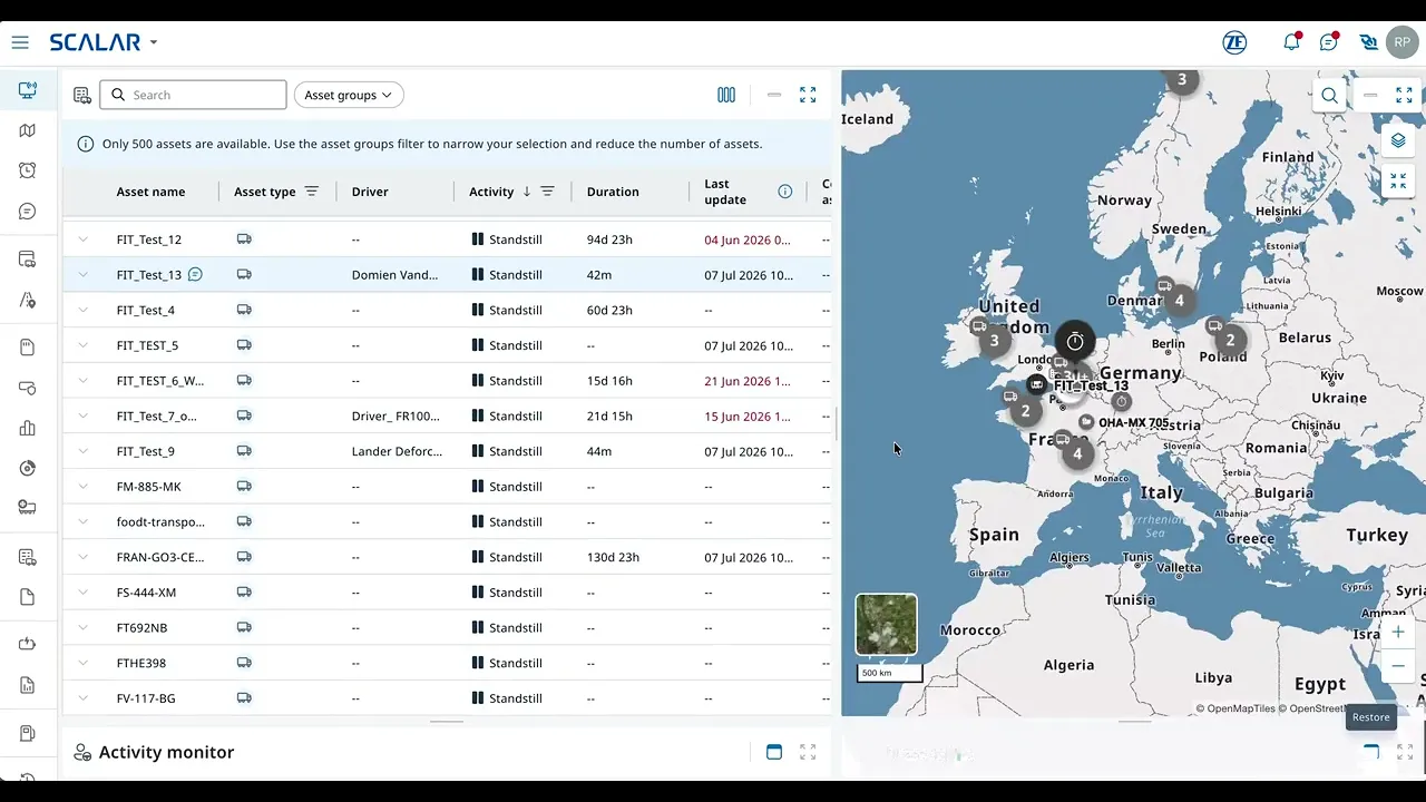
The SCALAR Live View isn’t scalable for medium and large fleets. Dispatchers must switch between tabs and click on each asset to access important information, and use another system or module to contact drivers, complicating daily operations. More data in a single view and easier driver contact are needed to streamline jobs to be done and improve decision-making.
Communication disconnected from monitoring: constant switching
Key info buried: multiple clicks to see driver and vehicle details
UI focus off: the map dominated even when not needed
High cognitive load when monitoring multiple vehicles
Business issue
If Live View does not reliably support dispatchers' primary workflows, customers will not migrate from our legacy platform — putting SCALAR adoption at risk.
Early enterprise customers had already migrated by 2024–2025, and their large fleets are exactly where the old Live View broke down — surfacing the blocker this redesign set out to remove.


To understand the problem and align with the teams we ran 3 workshops to define the problem statement. The team was: 1 Lead, Product designer x3, PO, PM, SA, UI designer.
Solution
A unified, fully customizable monitoring screen that brings vehicle data, driver communication, and quick actions into one view — adapting to each customer segment (truck, trailer, mixed fleets) so dispatchers see exactly the data they need.
Impact
Live View turned one of SCALAR's biggest adoption risks into a migration driver, with pilot customers eager to switch. V1 is now live as the primary fleet-monitoring screen and sits on SCALAR's official 2026 product roadmap, with migrations rising sharply through 2026 and expected to accelerate into 2027.
Discovery: from assumptions to evidence
To avoid designing based on assumptions, I led a mixed-methods discovery process involving customers and internal experts:
Research Methods
10 customer interviews across truck and trailer workflows
3 cross-functional workshops to align problem understanding (1 Lead, Product Designers x3, PM, PO, SA, UI Designer)
Usage analytics from 795 users on our legacy platform (revealing how dispatchers truly work today)
Tested several versions with 12 customers in total
Validation with in-product survey with Userpilot
Key insights
Technical data first, map second
“...I don’t always need the map. Experienced dispatchers rely more on the position in text format, so that space could show more useful data instead...”
More customization
“...it depends of the moment i need different data, also depends of the transport type, there are a lot of variables, so I need to customize the view to make sure I can find the data I need..”
High information density needed
“..Is it ok when I have all information, because switching from one tab to another I lose lot of time, and in the night I’m with my phone and I need to use 3/4 programs and every minute is gold because I want to sleep…”
Communication first
“Having to swap between screens is too clunky. You’ll miss messages or you’ll miss, you know, the messages from the drivers coming in all the time is what you’re watching really. You know, I want to treat it and they’re gone and trying to keep that screen clear and stuff. I think that's a vital part for me anyway.”
Trailer customers have different focus
“To see the temperature, the weight on the axle, the trailer weight — you're constantly switching between lines. You can't see everything in one place.”
Empty columns in the grid
“...I don’t always need the map. Experienced dispatchers rely more on the position in text format, so that space could show more useful data instead...”
Survey result
Survey to validate which data must be visible at a glance.
How our customers are using our legacy platform?
We monitored the behavior of 795 unique users interacting with the Vehicle Follow-Up in TX-CONNECT module over a period of 2 month (From April 24).
Define, Validate, Iterate and repeat
To avoid designing based on assumptions, I led a mixed-methods discovery process involving customers and internal experts:

User Journey build together with the PM, mapping out the journey of the dispatcher from the start of the shift.
Vision alignment
This insight was identified during a workshop where we aligned on the vision about what is the purpose of our live view, under the category "What live means for customers" we identified that Live means Real-time data uses as starting point for investigation.

Wireframing and testing
I ran several rounds of testing, sharing each with stakeholders for feedback. Once we had a solid direction, I tested it with customers.

Option 1
Cons
Users don't understand that to access to the other screen need to click on the kebab menu.
Messaging part too small
The priority should be on the message they receive from the driver and most of the time the message is very larga, because send reference numbers of the goods.
Pros
Customizable grid
Customizable columns
Easy to sort assets by activity
Messaging in the same screen — easier to track driver messages

Option 2
Cons
No graphical overview of service times — dispatchers can't get a "helicopter view" of the driver's day
Messaging has the same issues as Option 1
Pros
Clicking an asset opens a deeper investigation, with shortcuts to historical data on other screens
Same pros as Option 1

Option 3
Cons
Each activity needs a dedicated color to make the driver's day easier to read
Pros
Widget-based approach — users can resize every part of the screen
Messaging widget is clear and focuses on the latest message sent or received
Graphical overview opens in one click — dispatchers understand the driver's day in seconds
Final version and current state
V1 is live and in use. We're now developing V2, focused on helping dispatchers manage exceptions — with AI surfacing the situations that need attention instead of dispatchers monitoring everything manually.
Short demo of PHASE 1 of Live-view. Dev environment.

High fidelity screen

Right-click on an asset in the map widget opens a popover with an overview of the most important information.

Right-click on an asset in the grid widget opens a popover shortcuts to other screens.
Before / After comparison
Driver messaging lives in the same view (vs. switching to a separate module)
Dispatchers choose the columns they need (vs. fixed layout with empty columns)
Key data visible at a glance (vs. multiple clicks per asset)
Map no longer dominates when not needed
Layout fully customizable

Legacy platform

Old SCALAR solution

New Live-view solution
Strategic Impact — Accelerating Customer Migration
The redesigned Live View became one of SCALAR's most strategic projects. By solving dispatchers' core operational pain points, it increased user confidence and positioned the platform as ready for large-scale migration. V1 is now live and in use, with V2 in active development.
Validated
Tested through 4 rounds of task-based sessions with 12 customers — dispatchers completing real monitoring and driver-contact tasks on the new view.
10 of 12 chose the redesigned Live View over the current SCALAR version, grounded in behavioral analytics from 795 legacy users.
Recognized internally as a major UX upgrade for daily operations, and placed on SCALAR's official 2026 product roadmap.
Key Outcomes
Pilot customers expressed strong motivation to migrate to SCALAR
Improved communication and situational awareness in one unified view
Simplified monitoring of complex fleets (truck + trailer)
The new Fleet/Dispatcher view is on SCALAR's official product delivery roadmap as a 2026 milestone — a signal of how central this screen is to making large-fleet migration viable.
Projected — visible in the company trajectory
Live View V1 shipped into an active migration and delivered features large fleets had been missing — directly addressing the gaps that made the old view a blocker. Since launch, new large-fleet customers have migrated onto the platform, and company-wide migration has accelerated through 2026 (chart below).
I'm deliberate about attribution: the company-wide curve has several inputs — pricing, sales motion, platform maturity — so I don't claim Live View as the sole cause. But it removed a known blocker for large-fleet accounts, and migration among exactly those accounts has grown since it shipped.
How we're measuring success
Now that V1 is live, we're tracking impact against the 2024–25 baseline:
Migration rate (customers per quarter) vs. baseline
Live View engagement and retention among migrated customers
Reduction in support tickets related to monitoring and driver communication
Next steps — V2: from monitoring everything to managing exceptions
Discovery surfaced a problem V1 didn't solve. In our legacy analytics, the alarms tab had just 2% usage — dispatchers effectively ignore alarms today, even though reacting to exceptions is core to their job. V1 fixed awareness and communication, but exception handling is still manual: dispatchers scan everything to catch the few things that actually need them.
V2 shifts that. Instead of watching the full fleet, dispatchers are surfaced only the exceptions that matter — an approaching tacho violation, a delivery at risk, an unexpected standstill — with the system proposing the next action, like drafting a message to the driver. The dispatcher stays in control and confirms; the AI removes the detection and triage load. This directly extends V1's scalability goal: if a dispatcher only handles exceptions, one person can manage a larger fleet.
Open questions we're working through
Trust — how do we earn confidence in AI suggestions when decisions are safety-relevant (driving and rest times)?
Fallback — what happens when the system is wrong, and how does the dispatcher override it?
Autonomy — how much should the AI act versus only suggest, and where's the line dispatchers are actually comfortable with?